
A matrix of contour plots
What's better than a contour plot?
Nine contour plots.
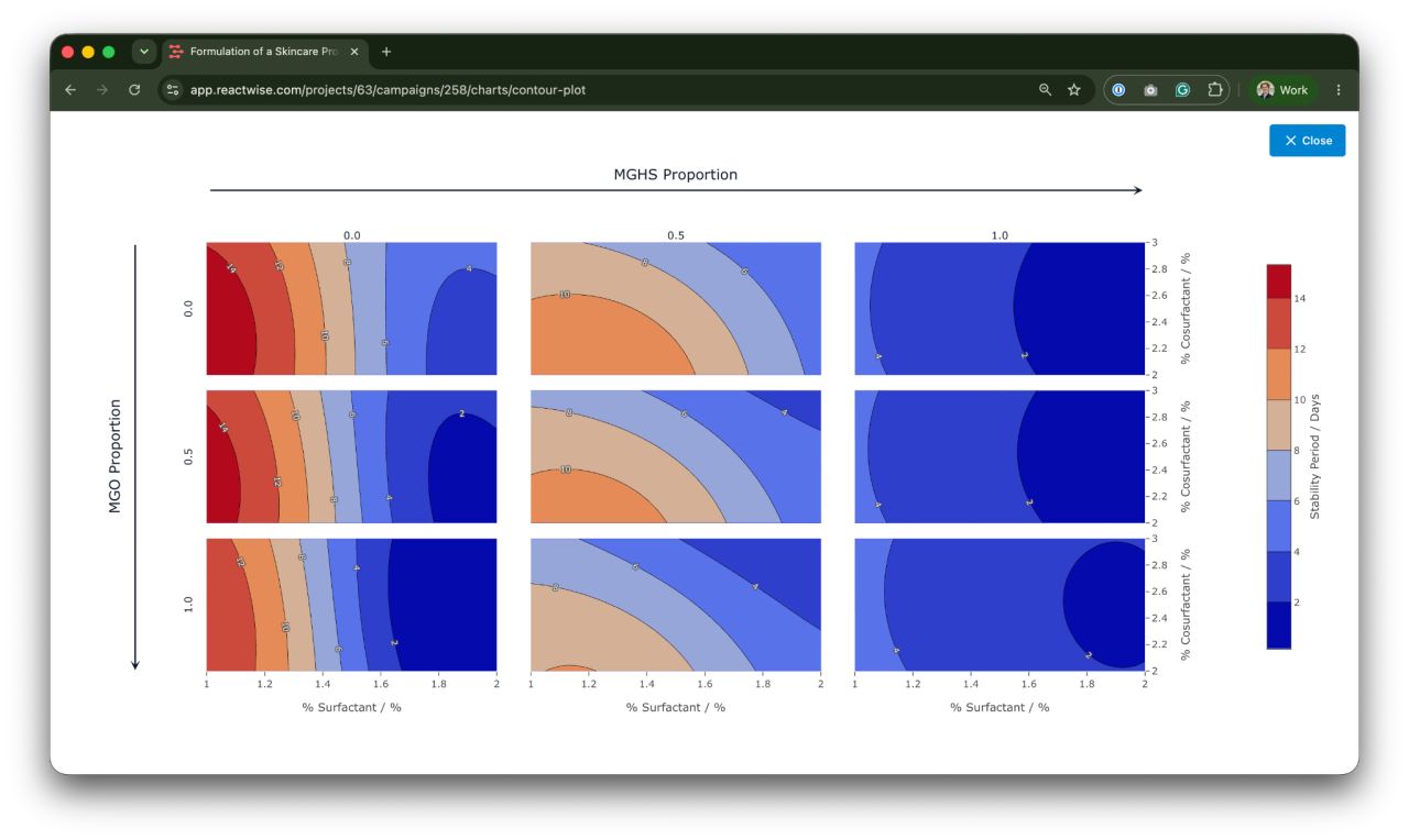
Below is a screenshot from ReactWise - a 3x3 grid showing how a skincare formulation behaves as you change the ingredients.
Visualizing data well is super important. Chemists aren't tweaking one thing at a time - whether it's formulations, API synthesis, or something else, they're juggling numerous ingredients that all interact, and the best combination is rarely the one you'd guess.
A good picture turns a pile of numbers into something you can read in seconds: where's the sweet spot, and which way to head next.
So what's on the plot? The goal here is stability - how many days the product stays intact before it separates. Each axis represents a surfactant level, and each mini-plot tests a different mix of the surfactant components. Red is good (~14 days), blue is bad (~2 days).
The story jumps right out. The best region sits in the top-left, deep red, around 14 days. Move across to the right, and stability collapses to blue no matter what else you do. So your next experiments belong in that top-left corner - and there's no point burning batches on the rest.
The best optimization software doesn’t just tell you what experiment to do, it also tell you why.